A picture is worth a thousand words, and software is no different. A good diagram will do in one glance what three paragraphs cannot. The catch is that drawing takes time and the payoff is invisible on the day you spend it, so the first question is not how to draw but when it is worth drawing at all. I use a rule borrowed from how I think about duplication in code:
If you are about to explain the same part of the system for a third time, stop and draw it.
A request for a meeting is the same signal. When someone asks me to schedule half an hour so I can walk them through part of a system, I consider spending that half hour drawing it instead. I send the drawing first and let them review it. If they still want to meet, their questions tell me exactly where the picture is unclear, incomplete, or aimed at the wrong person.
The explanation stops being something you perform and becomes something you own. The hard part is almost never the drawing itself. It is knowing where to start.
Start With Who Is Looking
Before anything goes on the page, name the person who will read it. An engineer, a product manager, a designer, someone in leadership, an investor, an auditor. Each of them opens the same picture wanting something different.
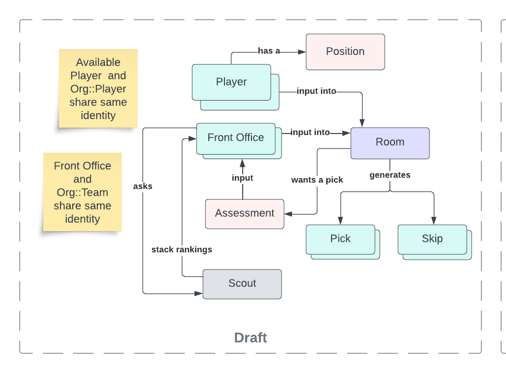
You stop asking whether a detail is important in general and start asking whether it is important to that person. A back-end engineer needs to see how a request crosses a service boundary, while someone in leadership needs to see which team owns what, and neither belongs on the other’s page. I never wrote the audience down for the basketball drawing, but I chose one all the same: the picture sits near the top of a library’s README, which means the reader is an engineer deciding whether this thing models the problem they have.
Narrow It to One Message
A software system is a three-dimensional object: code, runtime behavior, deployment environments, data, interfaces, teams, and business goals, all occupying the same space at once. A page is flat. Every picture is one slice of that object.
So the goal is a single sentence you could write underneath the picture, and it usually starts with “this shows.” This shows how our major systems depend on one another. This shows how data moves through checkout when a payment fails. This shows where the network boundaries sit. If you cannot finish the sentence you are not ready to draw, and whatever you produce will be the wall of boxes and arrows everyone has seen, so write the sentence down and put it next to the picture the way the basketball README carries its description directly above the diagram.
Choose a Notation and Commit
With the who and the what settled, the how comes down to picking a visual language, and there are roughly three. Formal notation is precise enough to reason about mathematically, which is rigorous, slow, and something I have never once needed. Semi-formal means an established language like UML or an entity relationship diagram, where you inherit a vocabulary other people already read, and that is worth a great deal when the shapes you need are shapes the language already has. Informal means you invent the conventions yourself, which is quick, unconstrained by whether a modeling language anticipated your problem, and where I spend nearly all of my time.
The basketball drawing is informal: a dashed boundary marks a bounded context, a stacked box marks a collection, and a sticky note holds a remark the shapes cannot make, like two elements in different contexts sharing one identity. None of that came out of a manual. Whichever kind you pick, stay inside it, because a picture that is half UML and half improvisation asks the reader to work out which rules apply where.
Three Rules That Do Most of the Work
Informal does not mean loose. Invent whatever you like, then hold to three rules:
- Label every element. A bare rectangle is a question.
- Label every line. A line says two things are related and then leaves the reader guessing how, which a verb fixes: the room generates a pick, the front office asks the scout for stack rankings.
- Publish a legend. Color, shape, border, line style: if it carries meaning, define it, because that is the difference between a notation and a decoration.
You can invent the notation, but you still have to explain its grammar.

Mine names five kinds of box: entity, aggregate root, value object, service, and bounded context. Four are separated by fill color, which is fast to draw and fast to read, though color alone does not survive a grayscale printout or a reader who cannot tell those fills apart. The fifth is a dashed border, and shape holds up where color does not. Either works, and neither works undefined.
Write the Catalog Underneath
The last step is the one people skip, and it is the one that turns a drawing into something that outlives the conversation it was drawn for. Every element in the picture gets a row in a table: a name and a description. The table is where the reader goes when the box was not enough. A box labeled AWS tells them roughly where they are; the catalog tells them which account and what runs in it. The picture stays readable because the detail moved somewhere the picture does not have to carry it.
Basketball’s catalog runs to thirty entries in alphabetical order. Four of them:
| Element | Description |
|---|---|
| Assessment | When the Room needs to know who a Front Office wants to select, the Room will send the Front Office an Assessment. The Assessment is a report of where the team currently stands: players picked, players available, and round information. |
| Front Office | Identifiable as a team, contains logic for how to auto-pick draft selections. |
| Room | Main object responsible for providing an iterable interface capable of executing a draft, pick by pick. |
| Scout | Knows how to stack rank lists of players. |
A cartoon becomes documentation when the reader no longer needs its author in the room.
What You Just Drew
Pick a reader. Narrow it to one message. Choose a notation. Label every element, label every line, publish a legend. Write the catalog. That is the whole method.
It also happens to be most of a formal documentation practice. In the SEI’s Documenting Software Architectures: Views and Beyond, the picture you just made is called an architecture cartoon, borrowed from fine art, where a cartoon is the sketch you make before the real thing. Wrap that cartoon in the supporting documentation and you have an architectural view, whose template opens with exactly two things: a primary presentation and an element catalog. The drawing and the table, which are the two that take real work. What is left is context, variability, and rationale, and that is a subject for another post, so if you draw one good picture and write the catalog underneath it you are already most of the way there.
Clear architecture documentation is not a talent. It is a repeatable process.
TL;DR
Draw when you are about to explain the same part of a system for a third time, or when someone asks for a meeting you could answer with a picture. Software is a three-dimensional object and a page is flat, so every diagram is a deliberate act of leaving things out: decide who is looking before you draw, and narrow the picture to one sentence you could write underneath it. Choose a notation, whether formal, semi-formal like UML, or informal conventions you invent, and stay inside it. Label every element, label every line, and put every convention in a legend. Finish by giving every element a row in a catalog table, which is what lets the drawing answer questions without you. Do all that and you have built the first two sections of what the SEI calls an architectural view.
Domain Language
- Architectural View
- A representation of a set of architectural elements and their relationships, selected to address a particular concern.
- Architecture Cartoon
- The graphical portion of a view’s primary presentation, without its supporting documentation.
- Element Catalog
- Supporting documentation that defines the elements and relationships shown in a drawing.
- Formal Notation
- A visual language whose meaning is defined precisely enough to support mathematical reasoning about the system it describes.
- Informal Notation
- A visual language using conventions chosen for the system at hand rather than inherited from a standardized modeling language.
- Primary Presentation
- The part of an architectural view that shows its elements and relationships, usually graphically.
- Semi-Formal Notation
- An established modeling language, such as UML, that supplies a shared vocabulary without attempting to prove a system correct.
Further Reading
The SEI’s Documenting Software Architectures course is where I learned to sort notations and to start from the stakeholder rather than the system. Paul Clements and colleagues’ Documenting Software Architectures: Views and Beyond, Second Edition is the full method behind it, including the view template this post stops halfway through.